Wedding Decor Rental Website: Conversion Optimization Guide
Two clients, both in similar markets, both buying the same inventory from me, both spending about the same on Google Ads.
One reorders from me every six weeks with a $4,800 average order, and he just hired two part-time setup crew. The other hasn't ordered in four months — his last order was $1,200, and he told me he's thinking about getting out of the business entirely.
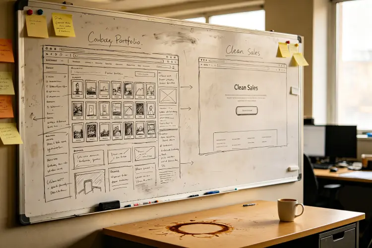
I couldn't figure it out. Then I looked at their websites.
The successful one looks like 2019 threw up on it. Ugly template. Stock photos that aren't even his products. But every page has one thing screaming at you: "Get a Quote." Top. Middle. Bottom. His form? Three fields. Name, email, date.
The struggling one is gorgeous. Custom build. Real photography. Video background. Awards. Testimonials everywhere. I had to scroll to find a CTA. His form had eleven fields. Eleven. Including "How did you hear about us?" and a box that said "Tell us about your vision."
Portfolios vs sales machines. That's the whole game. Portfolios get "oohs" and "aahs." Sales machines get booked. Most rental companies build portfolios. This is how to stop.
1. Your Contact Form Is the Problem (And the Easiest Fix)
Go look at your form right now. Count the fields. I'll wait.
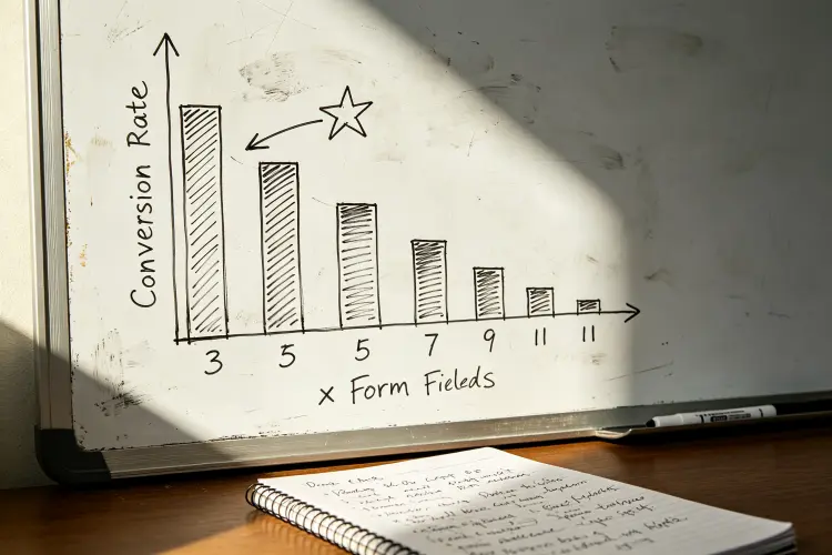
More than four? You're bleeding leads. HubSpot measured this — four fields to three = 50 percent more conversions. Another study: eleven to four = 120 percent more. Not 12 percent. One hundred twenty.
Who fills these out? A bride. 47 tabs open. Comparing six companies. Tired. Sees eleven fields. Thinks "later." Never comes back.
What do you actually need before the first call? Name. Email. Date. Maybe phone. That's it. Budget? You'll find out. "How did you hear about us"? UTM codes. "Your vision"? You'll ask on the phone.
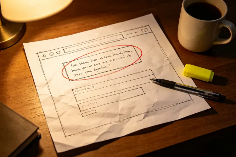
I had a client in Charlotte with a nine-field form who was getting 2-3 quote requests a week. I told her to cut it to three fields: name, email, event date. She looked at me like I was crazy. "But the budget!" she said. "You'll get it on the call," I said. She did it. Week one: 11 requests. Week two: 14. She's now averaging 12-15 a week — same traffic, same ads, same business, just fewer boxes to type in.
And her close rate? Didn't move. Because someone willing to type three fields is just as serious as someone willing to type eleven. They're just less annoyed.
2. One Page, One Job
Most homepages try to do everything. Hero with tagline. About section. Services. Why choose us. Testimonials. Gallery. Newsletter. Social links in the footer. Six possible actions. No priority.
Six choices = zero choices. People freeze. Your homepage exists for one reason: get a quote request. Everything else can live on its own page.
Portland. She had the everything-homepage. Killed the gallery from it. Killed the newsletter. Moved About to its own page. Three "Get Your Custom Quote" buttons — above fold, after services, at bottom. Form from seven fields to three.
Four requests a week became seventeen. Seventeen. Same traffic. I keep saying "same traffic" because it matters — this isn't about getting more visitors. It's about getting more of the visitors you already have to actually do something.
And landing pages? Same principle, one level deeper. Don't send your "flower wall Austin" ad clicks to your general homepage. Send them to a page that's only about flower walls in Austin. Pricing for flower walls. Photos of flower walls. Form that says "Get your flower wall quote."
Seattle did this. One homepage for everything → four product landing pages. Cost per lead $89 → $41. Lead-to-booking 6% → 18%. He told me it was the best ROI thing he'd ever done. This from the guy who dropped $12K on a custom site the year before.
First landing page takes a day. Second takes three hours. Third takes an hour. Then they run forever.
Your inventory should work as hard as your website. Our commercial-grade flower walls and arches last 5+ years and come in 40+ colors. Get wholesale pricing →
3. The Price Question Nobody Wants to Answer
"But competitors will undercut me!" "Every wedding is different!" "My clients want custom quotes!"
I hear this every time. And every time, here's what actually happens: visitor likes your work. Looks for prices. Can't find any. Leaves. Goes to the guy who shows ranges. You think marketing failed. Marketing worked — they showed up. Your missing prices chased them off.
Unless you're doing $50K+ corporate where every deal is negotiated, show ranges. Not exact quotes. "Flower walls $350-$600." "Arches $250-$450." "Full packages from $2,800."
Yes, some leads disappear. The ones who can't afford you. Good riddance. You don't want a 30-minute call with someone whose full wedding budget is $500. Ranges pre-qualify. They save your time. They raise lead quality.
Denver. Refused for two years. "I don't want to box myself in." Finally caved. Added ranges. First month: requests down 20%. He called me furious. I said check your close rate. 14% → 31%. Total bookings up. Revenue up. Fewer bad calls, more good ones. He still mentions it.
4. Everybody's Looking at Your Site on a Phone
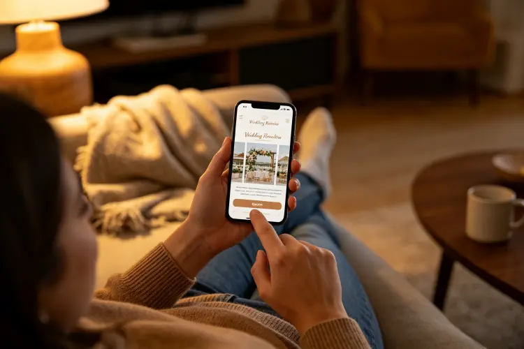
Wedding industry data consistently shows that about 70 percent of wedding-related searches happen on phones. Not laptops. Coffee shop lines. Lunch breaks. 11pm in bed. Phones.
Most rental sites are built for desktop. Tiny buttons. Tiny text. Forms wider than the screen. Menus you pinch-zoom. 8MB hero images that take forever.
48 percent of mobile pages pass Google's Core Web Vitals. If yours is in the other 52, you lose rankings AND conversions. Double hit.
Test this yourself. Phone out. Go to your site. Try to request a quote. Timer on. If it's 15+ seconds before you see the form — problem. If you pinch-zoom once — problem. If your thumb misses the button — problem.
Phoenix. We did this together. His contact button was so small I missed it twice. The form scrolled sideways. Hero image loaded in 9 seconds on 4G. Fixed those three things. Mobile conversions 1.2% → 4.8%. Four times. Just from not being broken on phones.
High-quality inventory converts better than cheap alternatives. Our rental-grade artificial florals look real in photos and withstand 200+ uses. Request a sample →
5. Stop Hiding Your Best Testimonials
Everyone has testimonials. Almost everyone puts them on a page nobody visits. Or a carousel at the bottom that gets scrolled past.
Put them where people decide. Directly above the quote form. Beside the CTA button. Under the price. That's where the doubt creeps in. That's where a real voice helps.
Not "Great service!" That says nothing. "Sarah & Mike, The Grove, June 2026: 'Setup was 20 minutes early and the arch looked better than the Pinterest photo.'" That says something. Specific name. Specific venue. Specific detail. Specific result.
Three to five good ones, placed at decision points, beats fifty generic ones on a dead page.
Don't have any? Ask. Every client, after their event. One email: "Would you write one sentence about your experience? It helps other couples decide." Most say yes. Ten in a month.
6. What I Don't Know Yet
I'm not going to pretend I have this all figured out. Nobody does. Anyone who says they do is selling you something.
AI chatbots? Everybody's installing them. I've seen one rental company get actual bookings from one. One. I've seen six install then uninstall six months later — same four questions on repeat, zero leads. Too small a sample to call it. Maybe it works. Maybe it's busywork. Check back in a year.
Video on landing pages? One camp says +80% conversions. Another says it slows pages and kills conversions because nobody waits. Truth probably depends on the video. 15-second real setup clip = probably helps. 2-minute brand film = probably hurts. I don't have rental-specific hard data. Just observation.
Google AI Overviews? If Google answers "best flower wall rental Austin" directly, do people still click through? Some data says CTR drops 30-40%. Other data says the clicks that do happen convert higher because the visitor is pre-qualified. I don't know how this lands for rental specifically. Watching closely. Will report back when I have something real.
The basics haven't shifted in a decade. Clear offer. Visible CTA. Short form. Mobile works. Prices shown. Those win. Everything else is a gamble you can take once the basics are handled.
FAQ
Build a Website That Actually Books Weddings
Clear CTAs, short forms, price transparency, mobile-first design. The basics haven't changed in 10 years because they work. And while you're optimizing your site, make sure your inventory is just as high-converting — our commercial-grade artificial flower walls and arches last 5+ years, come in 40+ colors, and start at $35/piece wholesale.
Get Your Wholesale Inventory Quote