The first thing guests notice when they walk into a wedding reception is the color. Not the table settings. Not the lighting. The color. It sets the mood. It tells them what kind of celebration this is — romantic, modern, rustic, playful. And the flowers carry most of that color. But here is where couples often stumble: they pick a color they like, then try to force everything else to match it, without thinking about whether those colors actually work together. Choosing a color palette for your wedding flowers and flower walls is not about picking one color. It is about creating a family of colors that feel cohesive, intentional, and beautiful. This guide will show you how.
Start with Your Venue, Not Your Mood Board
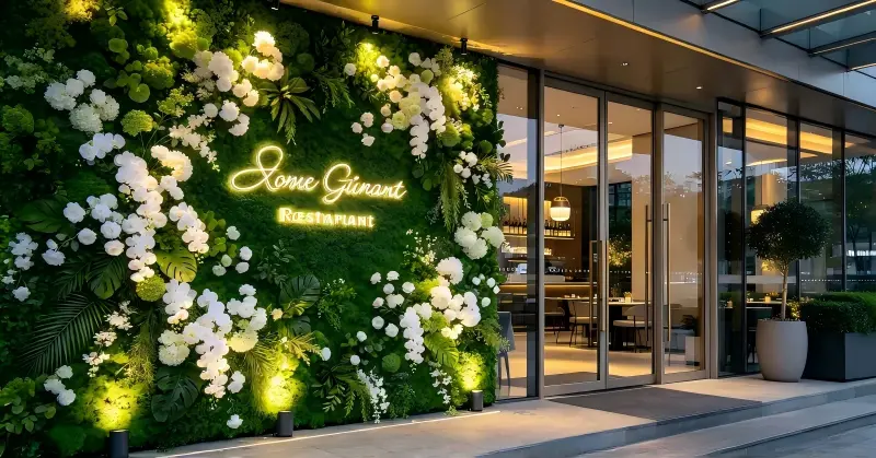
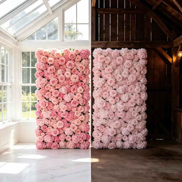
Many couples start with Pinterest. That's where they fall in love with a color combination — blush and gold, sage and ivory, burgundy and blush. But those colors were chosen for someone else's venue, not yours. Before you choose any colors, look at your venue. What are the fixed colors? The walls, the floor, the furniture, the existing decor. Your flower colors do not need to match your venue exactly — but they need to complement it. A blush pink flower wall that looks magical in a white garden pavilion might feel washed out in a rustic barn with dark wood walls. Start with what you have. Then build on it.
Use the 60-30-10 Rule
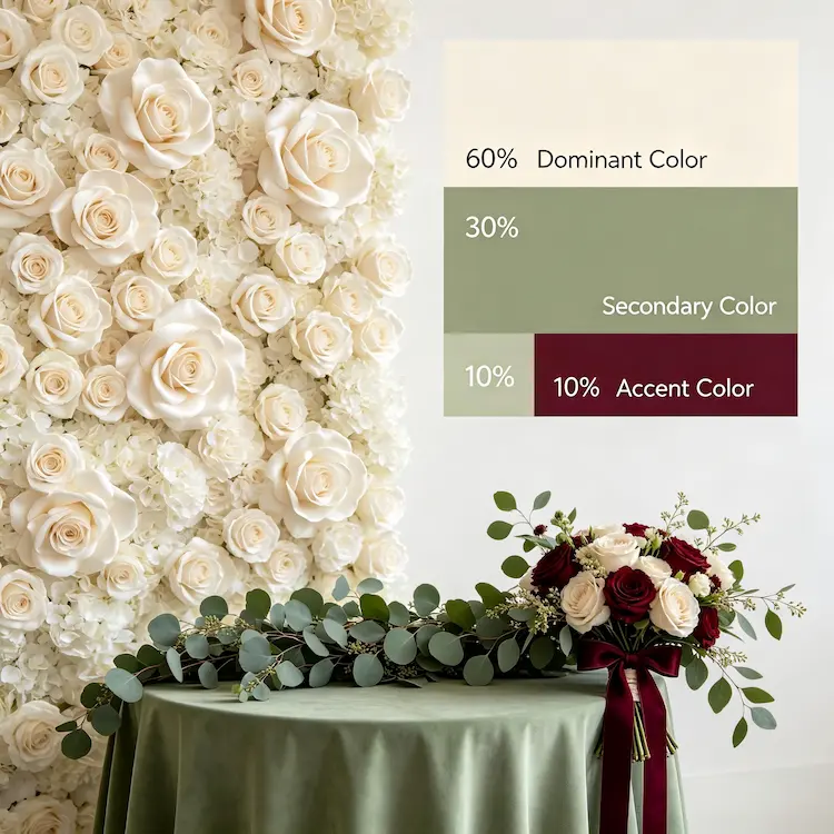
The 60-30-10 rule is a classic design principle that works perfectly for wedding florals. It works like this:
- 60% dominant color. This is your main color. It appears on the largest surfaces — flower walls, tablecloths, the overall floral backdrop.
- 30% secondary color. This supports the dominant color. It adds depth without competing. Think centerpieces, bouquets, or accent florals.
- 10% accent color. This is the pop. The unexpected touch. A single bold color used sparingly — in ribbons, signage, or a few standout blooms.
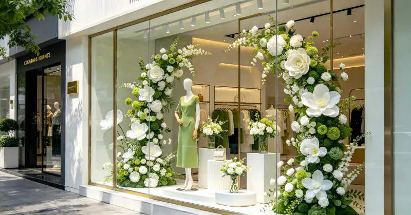
For example: a cream flower wall (60%), soft sage greenery (30%), and deep burgundy ribbon accents (10%). The result looks intentional, not chaotic.
Think About the Mood You Want to Create
Different colors create different feelings:
| Color Palette | Mood | Best For |
|---|---|---|
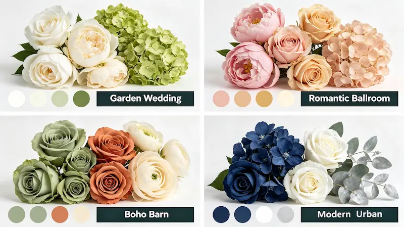
| White + Ivory + Greenery | Clean, fresh, timeless | Garden weddings, outdoor ceremonies |
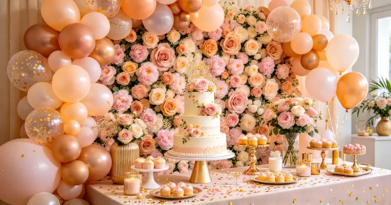
| Blush + Gold + Cream | Romantic, soft, elegant | Traditional ballroom, rose garden |
| Sage + Terracotta + Cream | Earthy, warm, grounded | Barn weddings, boho themes |
| Navy + White + Silver | Sophisticated, modern, crisp | Urban venues, winter weddings |
| Burgundy + Blush + Gold | Rich, dramatic, luxurious | Fall weddings, evening receptions |
Make Sure Your Flowers Match Your Flower Wall
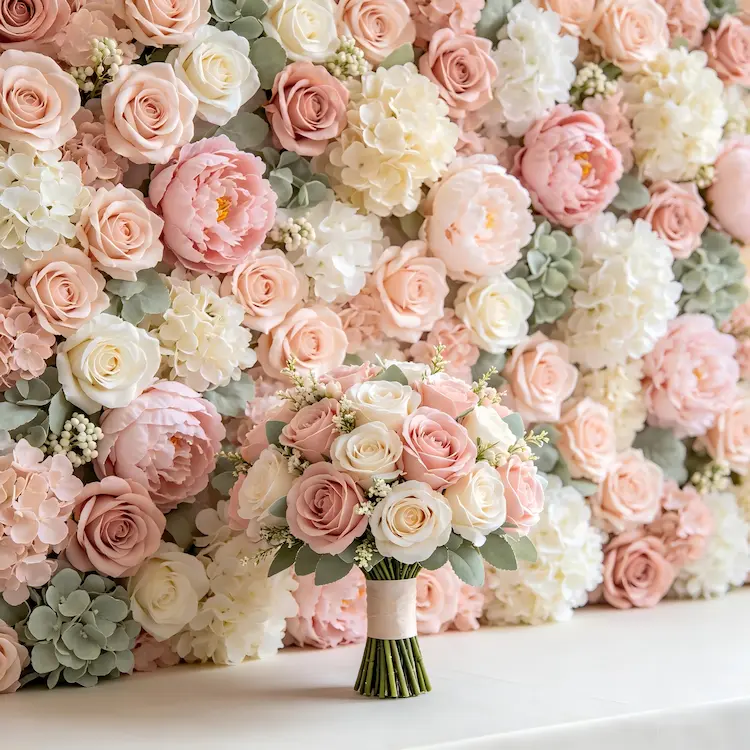
This sounds obvious, but it is one of the most common mismatches I see. Couples choose a stunning flower wall in one color, then order bouquets and centerpieces that don't quite match. The colors are slightly off. The undertones don't align. To avoid this, order your flower wall first, then match your other floral elements to it. Artificial flower walls are consistent — they don't fade or change color. Use that consistency as your anchor. If you are working with a florist, bring a sample of your flower wall color to your consultation.
Create a Color Story That Feels Like You
Choosing a color palette doesn't have to be stressful. Start with your venue. Use the 60-30-10 rule. Think about the mood you want to create. And make sure your flowers and your flower wall are on the same page. When everything works together, the result is not just beautiful — it's unforgettable.
Not sure what colors work best for your wedding? We can help. Browse our collection or reach out for a free color consultation.
Get a Free Color Consultation →
You may also find these resources helpful:
- 📖 Read More B2B Sourcing Guides – Explore our complete collection of sourcing articles for event planners.
- ❤️ Shop Heart-Shaped Flower Walls – Our best-selling B2B item for weddings and proposals.
- 📸 View More Project Case Studies – See how other clients use our artificial flower walls in real events.
- 📩 Request a Free Sample – Get a small sample piece to test quality before your bulk order.
- 🌿 Explore Our Full Product Collection – Browse all artificial flower walls, arches, flower balls, and wedding decor.
Published in: Application Scenarios | Estimated reading time: 6 minutes